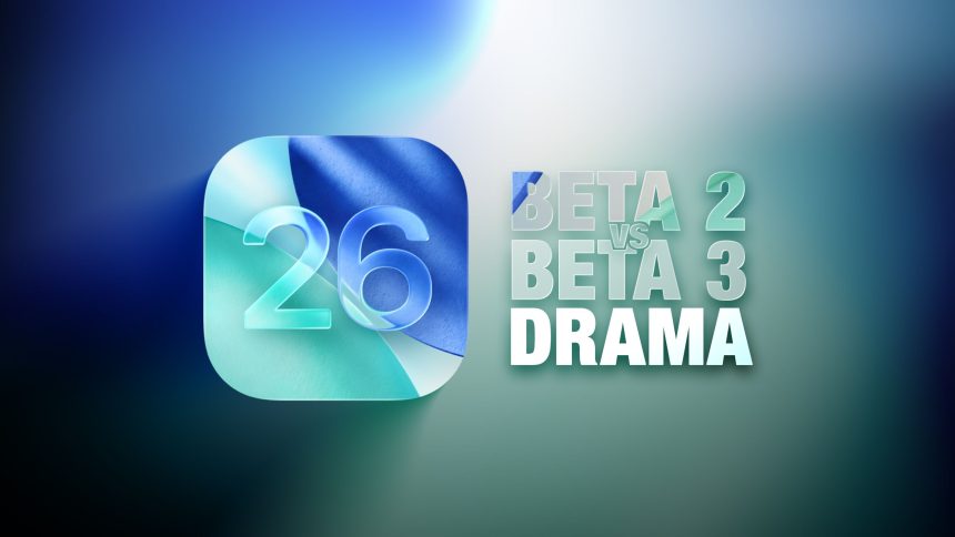
Apple has been actively refining its Liquid Glass design throughout the developer beta testing phase for iOS 26, with significant differences emerging between beta 2 and beta 3. While beta 2’s updates were met with minimal backlash, the design changes introduced in beta 3 have sparked frustration among users who feel the essence of the Liquid Glass aesthetic is being diminished.
Notably, in beta 3, Apple has opted for more opaque navigation bars across several apps. A range of side-by-side comparisons illustrates these changes, with beta 2 displayed on the left and beta 3 on the right.
**Apple Music** shows a marked shift, with its bottom navigation bar becoming more opaque and adopting a frosted glass appearance favored by Apple. This change stands out particularly against colorful backgrounds, as beta 2 featured a nearly translucent navigation bar that allowed more background color to penetrate, an effect that has been significantly muted in beta 3.
**Safari** exhibits variability in its updates, dependent on the background color of the website and the Tab View design. The URL bar in beta 3 has become less translucent and more opaque, reducing its color shifts. The transitioning effect to dark mode still occurs when scrolling over predominantly dark content, but the threshold for this activation has increased.
In the **App Store**, the navigation bar has shifted to nearly complete opacity, making it one of the most noticeable changes among the apps. Similarly, **Podcasts** now features a navigation bar that has almost entirely lost its translucency, especially when set against colorful backgrounds.
For **Apple TV**, the update is subtler. The navigation bar maintains its darker glass color, while the transparency level remains largely unchanged. In the **Photos** app, navigation bars also trend toward darker hues with minimal alteration in transparency.
In the **Calendar** app, navigation buttons exhibit increased opacity in both Light and Dark Modes. The **Spotlight Search** keyboard demonstrates a mixed approach to translucency; while the keyboard allows more background visibility, the search bar appears darker.
For users favoring Dark Mode, this option has retained more transparency compared to Light Mode, leading to a potentially less noticeable difference in navigation bar opacity.
Changes also vary based on background color—it can be hard to discern differences in transparency against white backgrounds, though updates become more apparent with lighter colors. Conversely, darker backgrounds may prompt navigation bars to adopt a more translucent dark mode view.
On the **Lock Screen**, time indicators are more opaque, while some notifications show a darker background, though these changes aren’t universally noticeable. The Home Screen and Control Center have seen little to no change, but the **App Library** now features a clearer search bar without blurred edges during scrolling.
Most of Apple’s built-in apps have undergone button and navigation bar adjustments. For example:
– In **Weather**, the bottom buttons are now visibly darker, and the search button is no longer translucent.
– The **Camera**, **FaceTime**, and **Clock** apps reflect no significant changes.
– In **Messages**, the search and message compose bars show affected translucency, while no changes have been reported for **Find My** and **Preview**.
What are your thoughts on these modifications in iOS 26 beta 3? Are you in favor of potentially reviving some aspects of the Liquid Glass design, or do you prefer the bolder opaque styles? Share your opinions in the comments below.Apple